on
Election Reflection
This blog is part of a series related to Gov 1347: Election Analytics, a course at Harvard University taught by Professor Ryan D. Enos.
Introduction
This election cycle led to some expectations being met and some surprises. A “red wave,” somewhat like the one predicted in my model, was unsuccessful, however the Republicans still won the House. Some safe House districts, like Colorado-3 with incumbent Lauren Boebert, became extremely tight races and Republicans won in places like New York that no Democrat expected to lose. Additionally, despite recent trends of the popular vote leaning Democratic while the seat share remains split, this election saw the voteshare/seatshare curve lie remarkably even.
Model Recap
To review, I started building my model with historical data of nationwide vote and seat share. I also used a dataset of generic ballot results. I then filtered that data down to only polls after September 1st in order to get results closer to the election. I joined the historical data and the generic ballot data, and created variables for the generic ballot differences. Finally, I joined in GDP data and created two sets of data, one of all election years and one of only midterm election years. I ended up with four total models, two predicting based on midterm years and two based on all election years, one each for Democrats and one for Republicans. Each model predicted the seat share outcome for the party it used as a basis, and calculated the results for the other party using simple subtraction. Below is printed the predictions of each of my models compared to the actual data.
I used the R_all model to make my final prediction of 225 Republican seats and 210 Democratic seats. The final 2022 result has yet to be called due to five undecided races, but at the time of this post, the New York Times estimates 222 Republican seats and 213 Democratic seats based on the margins of the uncalled races. Given that most of the votes have been counted at this point, these margins are unlikely to change significantly.
My final formula was this: lm(R_seats ~ repballotdif + presparty + R_seats_before + GDP_growth_pct, data = train_lm)
##    Model Republican Democrat
## 1  D_all        230      205
## 2  R_all        225      210
## 3  D_mid        237      198
## 4  R_mid        203      232
## 5 Actual        222      213
Accuracy
##    Model Error
## 1  D_all     8
## 2  R_all     3
## 3  D_mid    15
## 4  R_mid   -19
## 5 Actual     0
As you can see from the chart above, the R_all model had the lowest error of the four, proving that I chose the right model for my final prediction. In order to evaluate the accuracy of my model over time, I performed out-of-sample fit tests to analyze the difference between the predicted values and the actual values. Although my model draws on historical data back to 1944, I only performed the tests on data from the years 1984 through 2022, limiting it to the more recent half of my data set in order to see more modern trends.
 The mean of my errors was 9.27 seats, and when the 3 outliers on either end of the dataset were trimmed, it was 8.82. The median of the whole set was 8.19 seats. These are all pretty large median errors on their own, and when races are very close, indicate a serious insecurity about who could win the House. However, this margin only accounts for 2% of all House seats, meaning that the majority of seats can be called with a pretty high degree of certainty. These averages also fall very closely to the in-sample and out-of-sample errors that I received during my initial testing, showing that the 2022 result was not drastically different (and in fact was much better than those means).
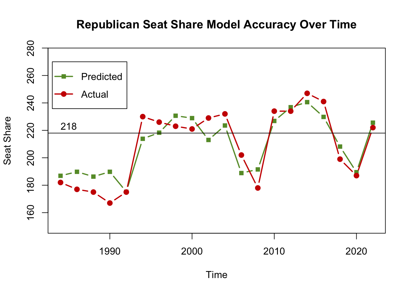
After analyzing the averages, I plotted the predicted and actual values for 1984 through 2022 in order to visualize their errors. I also plotted a line at 218 seats, the number required to gain a House majority. This shows a clear pattern, that the model only incorrectly predicted the winner of the House in three years, all before 2004. In every other year, the predicted value falls on the side of the winner. That means that despite the seat error, the model is still accurate in the most important question of the election.
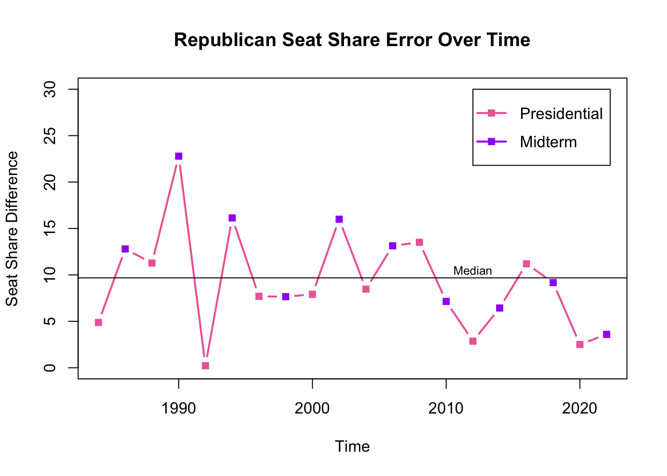
I also graphed the seat share error separately. I discovered that until 2010, my model predicted with relatively low errors in presidential election years and high errors in midterm years (with one exception in 1998). Starting in 2008, the pattern shifts slightly, with midterm election year errors becoming much lower. In the four presidential elections since 2008, two (2008 and 2016) had large errors and two (2012 and 2020) had small errors.
Hypotheses and Solutions
I used four dependent variables in my model: generic ballot lead or deficit, president’s party, Republican seats before the election and GDP growth percent. President’s party is expected to positively correlate with the opposite party, i.e. when the president is a Democrat, Democrats are likely to lose seats, especially in midterm years. Generic ballot lead or deficit communicates the margin by which the selected party is expected to win or lose according to polls. Seats before the election in collaboration with the generic ballot communicates how well the model thinks that the party will perform compared to the previous year. All of those variables seem to work in communication with each other, whereas GDP is an isolated actor.
Error Frequency
## [0-5) [5-10) [10-15) [15-20) [20-25)
## 5 7 5 2 1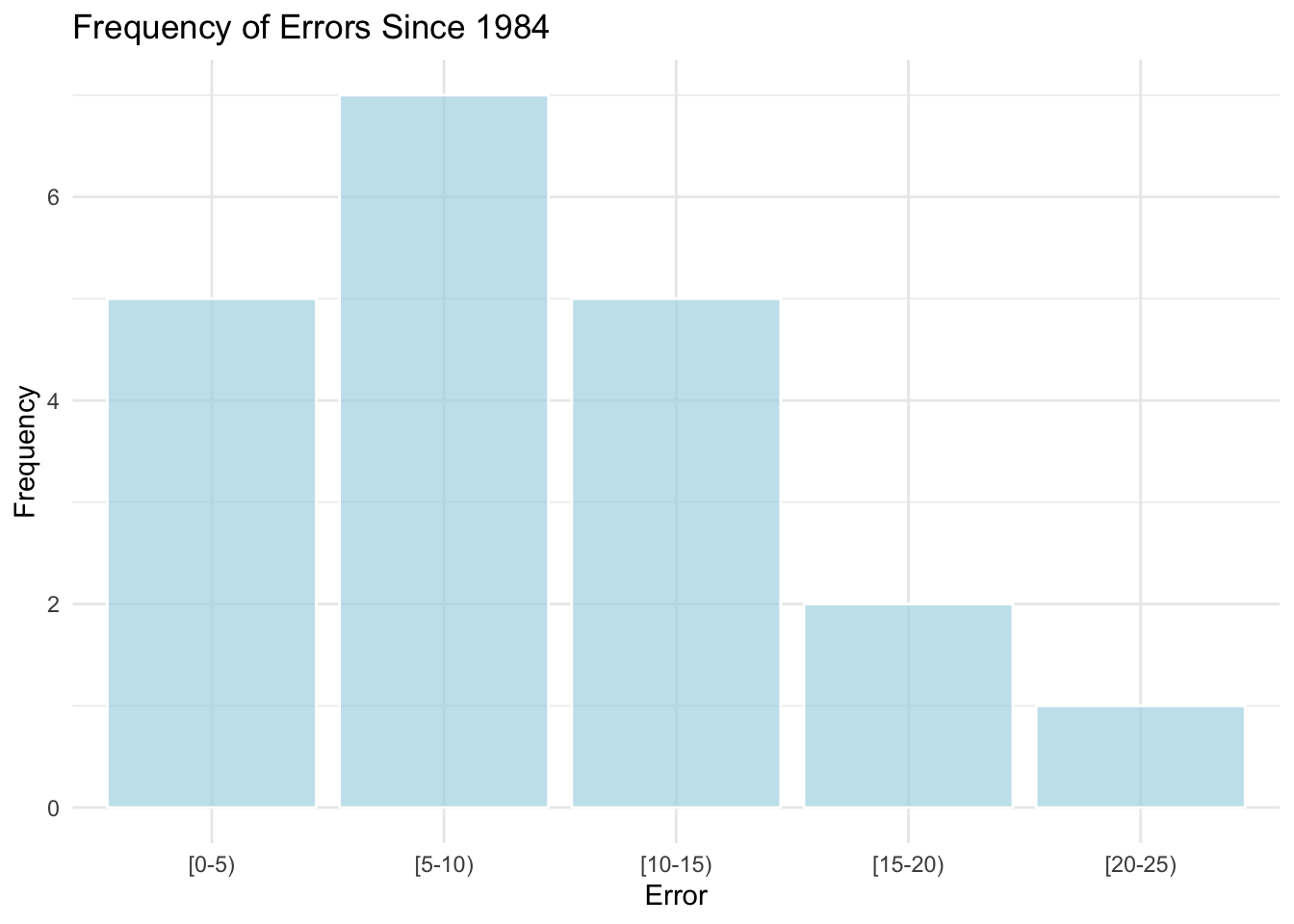 The graph above plots the errors between my predictive model and the actual results for the last twenty election cycles. 25% of predictions in the period had errors between 0 and 5, 35% had errors between 5 and 10, and 60% between 5 and 15. Since my model’s error for this election was only three, it shows that the model was somewhat more accurate this year than it usually is. In the next few paragraphs, I will explore reasons how the model error as a whole could be reduced but first, let’s discuss why the 2022 error was so low compared to other years.
I predicted that Republicans would win 225 seats and Democrats would win 210, but in reality, Republicans won 222 and Democrats won 213. My prediction was in line with many pundits who were speculating that we would see a “Red Wave” in which Republicans won significantly more. However, the wave never materialized. Politico theorizes that one reason for the failure of the Red Wave is that Trump-aligned candidates performed much worse than expected. Since my model was a national-level prediction, the generic ballot simply measured the percentage of voters who preferred each party and did not account for candidate personalities or likability.
GDP
When looking for inspiration for my model, I referenced Alan Abramowitz’s 2018 paper in the American Political Science Association review which created a model with high statistical significance. He, however, did not include economic indicators, which perhaps should have encouraged me to more thoroughly evaluate its impact.
In my initial tests with GDP at the beginning of the semester, there was a mediocre correlation. When looking at economic data, my RDI correlation was stronger than my GDP correlation, and the correlation with vote share was stronger than the correlation with seat share. Given that the r-squared was so mediocre, GDP does not seem like a worthwhile variable to include in the model. I left it in the model for my final prediction because I was relatively confident that economic impact played with voters psychologically enough to matter in the model, but, looking back on the situation, I believe it simply raised my r-squared, as each additional variable is known to do.
Immediately before the election, The Economist published an article examining the possible impact of GDP on the results. They evaluated how, despite increasing GDP numbers, their basis is false and important indicators such as consumer spending and housing prices are not suggesting good news. Rather, the positive GDP was made up of a decline in the trade deficit. This backs up my theory that GDP is not the best indicator of how voters will respond to economic change at the polls.
In order to evaluate whether the presence or absence of GDP significantly impacted my prediction results, I would first modify my model to remove GDP, and then I would take the same steps that I took in evaluating my original model. I would evaluate using in-sample and out-of-sample testing to determine the average errors and I would examine the 2022 prediction error. I would also experiment using RDI data and consumer sentiment index data instead of GDP data to see whether that yielded different results, particularly since data like the latter could represent voter thinking more accurately than just per capita income.
President’s Party
President’s party is another unusual variable. The second graph above suggests a correlation between presidential election years and prediction error. This introduces the possibility that the president’s party variable inaccurately shifts predictions, though I am not sure to what extent. In order to evaluate this, I would play with different models with the presence and absence of the variable, and possibly create new variables such as whether the president’s party is the same as the House incumbent party.
Thinking About The Future
For future models, there are a number of changes that I would like to explore which were either beyond my coding abilities this semester or required more time than I could devote.
First, I definitely would want to change GDP to a variable more grounded in voter experience, like consumer sentiment data. I believe that this would make GDP more reflective of individual voter experience. Additionally, I would like to expand my national-level prediction into a district-level prediction, using district-level historical data and generic ballot results. I think that this would allow me greater nuance in seeing whether there are patterns of inaccuracies in specific districts that need refinement. Given historical trends of regions that are consistently Democratic or Republican, this would allow me to narrow the search for inaccuracy down to swing districts. I think this would also end up being a more interesting analysis overall.
Ultimately, this semester and the model I built was an extremely informative way to be introduced to the concept of Election Analytics and I thoroughly enjoyed my time. I feel like I have grown a lot in my abilities throughout the last semester and I will most certainly think of political statistics in new ways going forward. I hope to explore similar concepts in the future.