on
Election Analytics: Blog Post 1
This blog is part of a series related to Gov 1347: Election Analytics, a course at Harvard University taught by Professor Ryan D. Enos.
Introduction
My name is Meredith Zielonka and I’m a sophomore at Harvard College studying Government, hopefully with a subfield specialization in data science. This semester, I will be assembling a blog in order to track the evolution of my predictions regarding the results of the 2022 midterms.
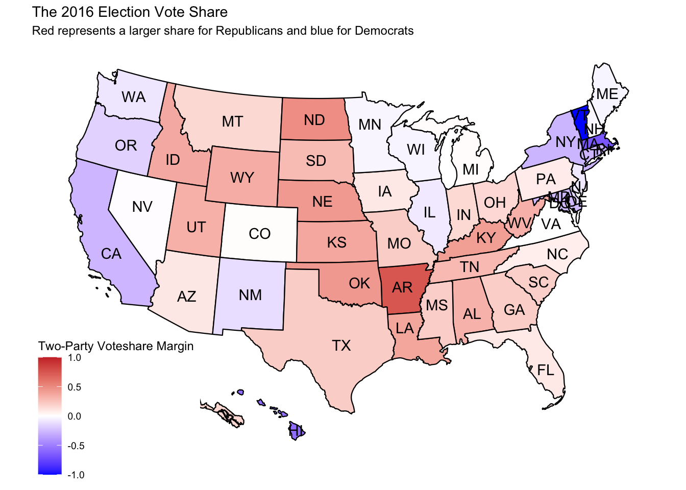
For my first post, I will be comparing the 2014 and 2016 House election results in order to search for patterns that will aid me later on in my predictive model. Since I am largely in the research-gathering phase of this project, I will be focusing on a more general question for my first analysis: How does Americans’ party choice differ between election and non-election years? In order to answer this question, I created two maps in R depicting voteshare by state, with one specifying congressional district as well.
This first map immediately tells us that the vast majority of elections have voteshare margins under 50%, with around fourteen states seeming to fall within a few points of zero. Very few states have extremely large margins. Vermont is the most extreme example of this, however in 2016 Vermont’s single representative effectively ran unopposed with no Republican challenger and the Liberty Union candidate winning 10% of the vote.
 This second map adds a layer of nuance, given the differentiation between congressional districts. This allows us to see that even on a district level, there are some but not many districts that overwhelmingly favor one party’s candidate. However, the districts with lower voteshare margins gave Republicans control of the House in 2014. This map also suggests that Democrats find their power in concentrated pockets, whereas Republicans are more sparse and have a smaller margin in more districts, convincing rural voters to side with them. If these patterns continue, this could inform national Democratic campaign strategy on how to most effectively target less secure seats and what voting population to turn the appeal towards.
All the data in this post came from the Election Analytics class repository, and all of the code behind these maps is stored in my personal Github repository.
This second map adds a layer of nuance, given the differentiation between congressional districts. This allows us to see that even on a district level, there are some but not many districts that overwhelmingly favor one party’s candidate. However, the districts with lower voteshare margins gave Republicans control of the House in 2014. This map also suggests that Democrats find their power in concentrated pockets, whereas Republicans are more sparse and have a smaller margin in more districts, convincing rural voters to side with them. If these patterns continue, this could inform national Democratic campaign strategy on how to most effectively target less secure seats and what voting population to turn the appeal towards.
All the data in this post came from the Election Analytics class repository, and all of the code behind these maps is stored in my personal Github repository.